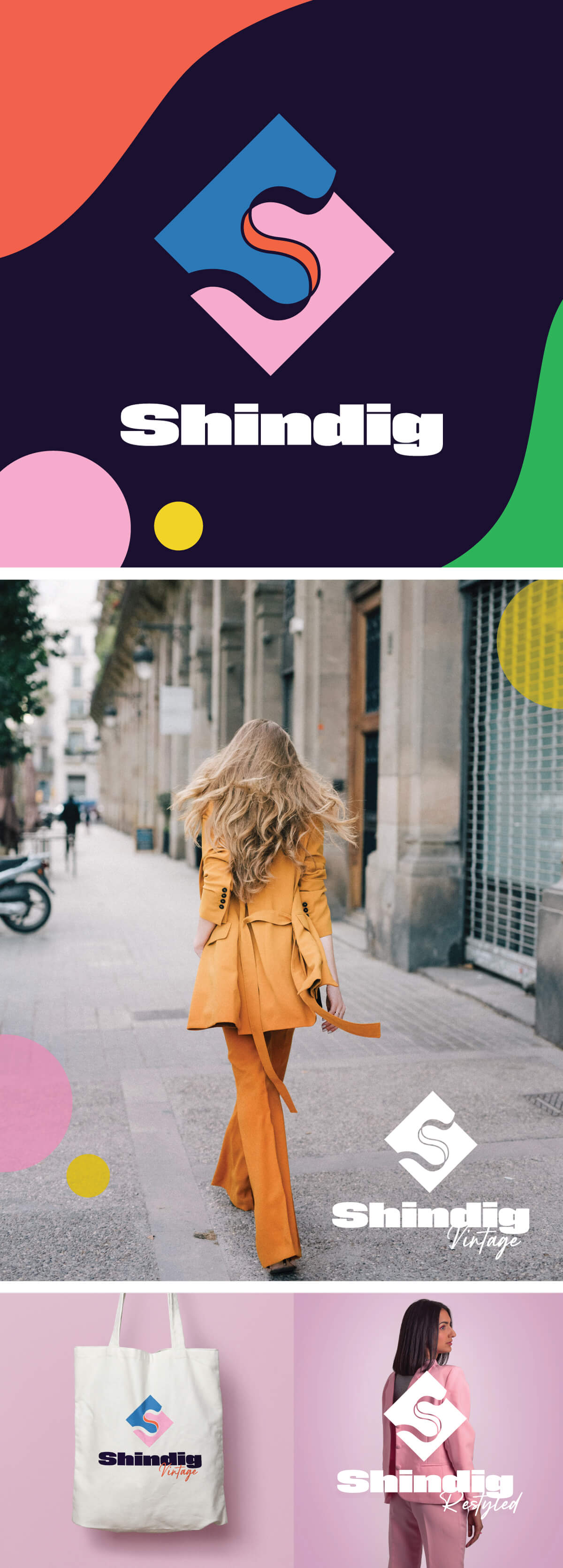
Shindig
Brand Design • Visual Identity
The Shindig logo redesign was inspired by Shindig’s journey from 1989 to now. The S shape forms a path and link in the motif, with the staggered alignment representing the unique feel of the Shindig brand and customer. The colour scheme is a fresh take on the colour palette of retro advertising.